How To Use - Plots and Features Overview
Following is an overview that describes the plots and features of Mimer, used for visualization and knowledge discovery. This tutorial offers a step-by-step guide a user should be able to replicate to reach the same results
Data
This tutorial uses the following dataset:
tdata2
Which contains the non-dominated solutions from one rune of the DTLZ1 problem [1] with three objectives (y0 - y2) and
seven decision variables (x0 - x6). The dataset has 924 solutions.
Data Visualization Plots
There are five ways to directly visualize a dataset in Mimer:
- 2D scatterplot
- 3D scatterplot
- Parallel coordinate plot
- Boxplot
- RadViz [2]
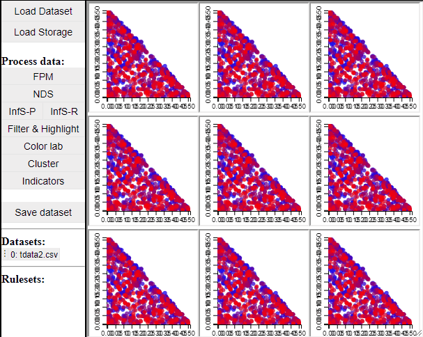
2D & 3D scatterplots
2D and 3D scatterplots shows two or three dimensions of the data, however, a colormapping the solutions can indicate an additional dimension.
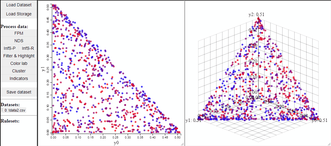
It is also possible to change which dimensions of the data that are visualized.

2D scatterplots also support interaction by lasso-selection of solutions, this highlights them in any linked plot as well.
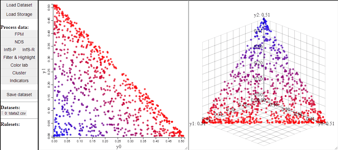
It is also possible to change the free-form lasso for a rectangle selection.

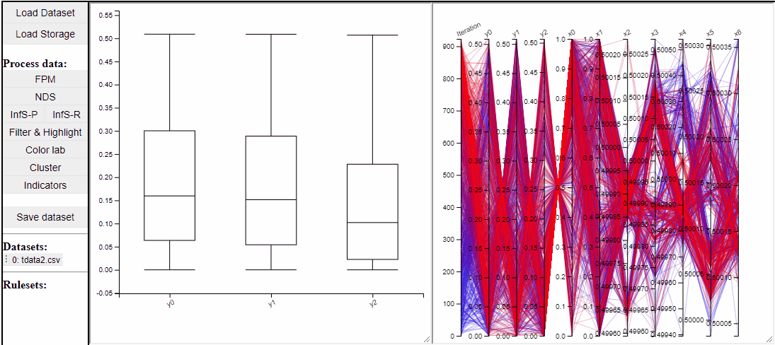
Parallel Coordinate Plot (PCP)
Parallel coordinate plots can show all dimensions of the data at the same time, while also colormapping to one specific dimension. It is also possible to choose which dimensions to visualize in the PCP.
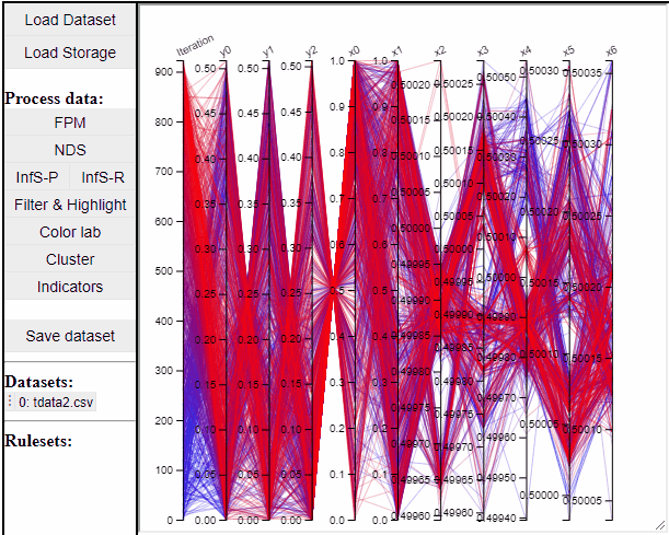

It is possible to add a filter to each dimension in the PCP. In this way solutions are filtered in all linked plots as well.

Filtered solutions can also be highlighted from the PCP.

Finally the dimensions in the PCP are scaled by default, but it is possible to un-scale them to potentially reveal interesting patterns in the data.

Boxplot
Boxplots are a common statistical tool to visualize the distribution in data. Like PCPs it is possible to select which dimension to include. It is also possible to toggle jitter, which shows the solutions distribution in the dimension of data.
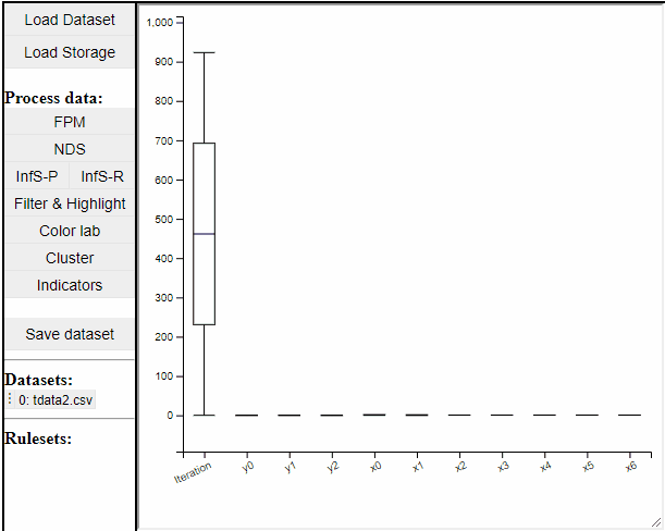
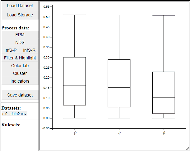
Boxplots also work with filtered and highlighted solutions.
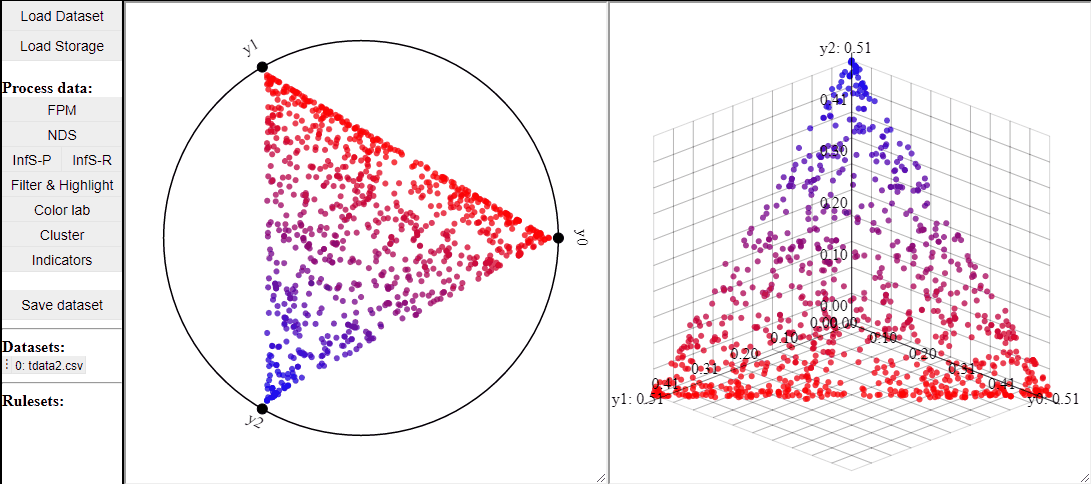
RadViz
RadViz is a visualization technique to show any number of dimensions in a 2D projection on a radial coordinate system. A RadViz plot can also colormap the solutions to one specific color.

Like 2D scatterplots, it is also possible to highlight solutions by lasso or rectangle selection in a RadViz plot.
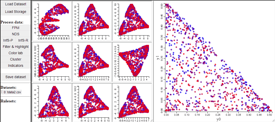
t-SNE
t-SNE is a manifold learning method that, like RadViz, makes a lower dimensional projection of higher dimensional data, while, unlike RadViz, also preserving the structure (such as clusters) in the data.
Since t-SNE is known to be very sensitive to its parameter settings, Mimer runs 9 instances of t-SNE with different parameter settings and finally asks the user to select the resulting projection they prefer. To run t-SNE, first select the dimensions of interest, adjust the parameters (or leave them), and run. For large data, the run-time might be high (the figure below has been edited).
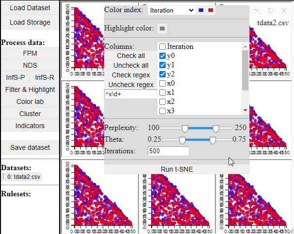
Selecting a projection adds two new dimension to the data, which can then be used to visualize the results in a 2D scatterplot. Clicking the 'Select projection' button add the dimensions, however, the 2D plot needs to be refreshed before the new dimensions can be used.
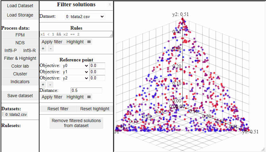
Filter & Highlight
The Filter & Highlight panel allows for interaction with the data outside of the plots. It allows for filtering and highlighting the solutions based on rules or based on the distance to a reference point.
Using Rules
Using rules of the forms {<, >, <=, >=, ==, !=} it is possible to both highlight and filter the solutions that live up to the rule. Filters and highlights can be reset using the corresponding buttons. Rules can also be combined using '&&'.

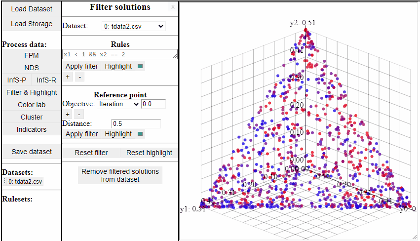
Several rules can be open at the same time to make it easier to switch between them.

It is also possible to permanently remove filtered solutions from the data. This is an irreversible action, but it is possible to duplicate the data to save a copy of the original before.
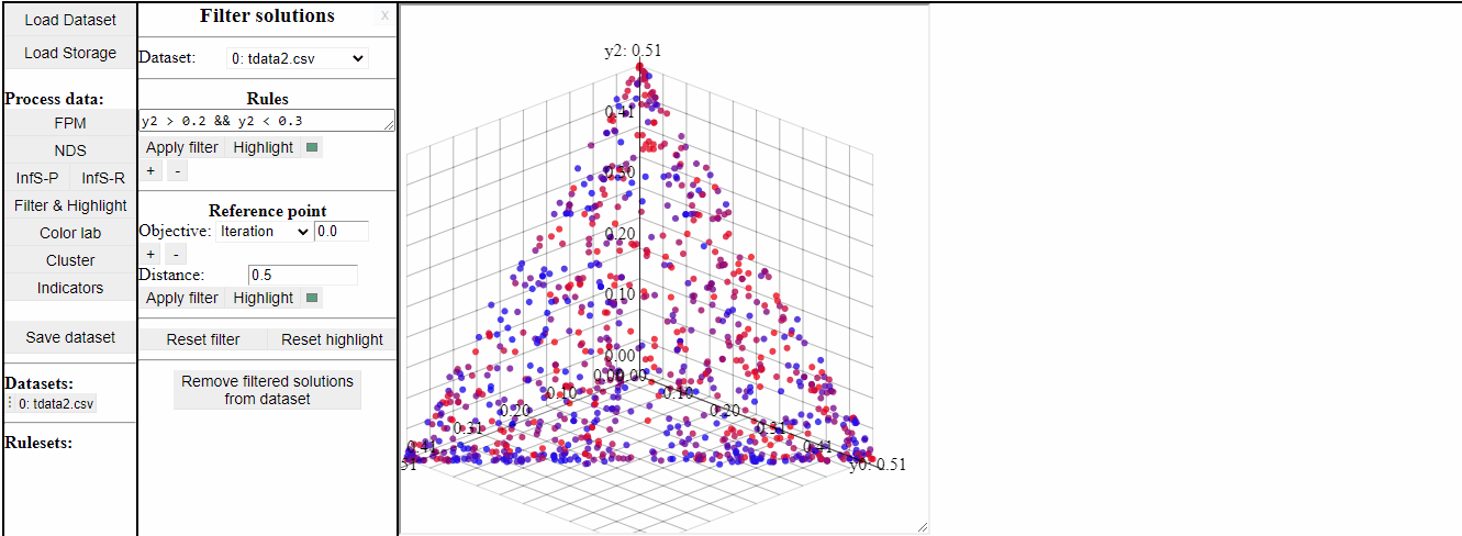
Using Reference Point
Using a reference point it is possible to highlight and filter solutions close to a specific point in any dimensions.

View
It is possible to save the current state of Mimer as a "view", which can be loaded to continue where you left off.
To Save the current state as a view, click the "save" button under the "view" header. To load a view, click the "load" button.

References
[1] Deb, K., Thiele, L., Laumanns, M., & Zitzler, E. (2005). Scalable test problems for evolutionary multiobjective optimization. In Evolutionary multiobjective optimization (pp. 105-145). Springer, London.
[2] Hoffman, P., Grinstein, G., Marx, K., Grosse, I. and Stanley, E., 1997, October. DNA visual and analytic data mining. In Proceedings. Visualization'97 (Cat. No. 97CB36155) (pp. 437-441). IEEE.
[3] Van der Maaten, L. and Hinton, G., 2008. Visualizing data using t-SNE. Journal of machine learning research, 9(11).